
Why AI Websites All Look the Same (And How to Make Yours Look Like Your Brand)
AI websites look the same because tools share training data, component libraries, and vague prompts. Here's the five-step fix that works in any tool.
Start for Free
In short
AI websites look the same because the tools train on the same popular sites, share the same component libraries, and get the same vague prompts like "make me a modern website." The fix isn't a better tool — it's giving the AI real design direction: locked colours, a typeface pair, your own photos, and copy in your voice.
Key takeaways
- AI websites converge on the same look because every model trained on overlapping data and shares the same component libraries (Tailwind, shadcn/ui, Inter)
- Vague prompts like "modern and clean" produce generic output — the AI fills the gap with the statistical average of everything it's seen
- For small businesses, a generic-looking site costs trust and bookings, not just aesthetics
- The fix: lock your brand tokens (colours, fonts, button style) before you prompt anything, then give the AI direction, not just a description
- One deliberate, on-purpose oddity — a hand-drawn detail, an asymmetric layout — is what makes a site memorable; AI defaults will never produce this on their own
Why do AI websites all look the same?
Four things stack up to produce the "AI look". None of them is a bug; they're what happens when you let defaults decide.
1. Every model learned from the same websites. AI builders and vibe coding tools (Lovable, Bolt, v0, Framer AI, Wix ADI) were trained on millions of live sites. The most common layout on the internet is a hero banner, three feature cards, a testimonial strip and a call-to-action. So that's the statistical "average website", and it's what you get by default.
2. They share the same building blocks. Most vibe coding tools generate code with the same libraries: Tailwind CSS for styling, shadcn/ui or similar for components, Inter as the font, Lucide for icons. Same parts, same result. It's why so many AI sites have that identical rounded-card, soft-shadow, purple-to-blue gradient look.
3. The prompt is doing all the design work, and it's vague. "Build me a clean, modern website for my yoga studio" contains zero design decisions. "Clean" and "modern" mean "whatever is most common." The AI fills the gap with the average.
4. Nothing holds the brand together across pages. Even when a first page looks distinctive, most tools regenerate each new page from scratch. By page four the colours have drifted, the buttons have changed shape and it looks like three different websites stitched together.
What does the "AI look" actually look like?
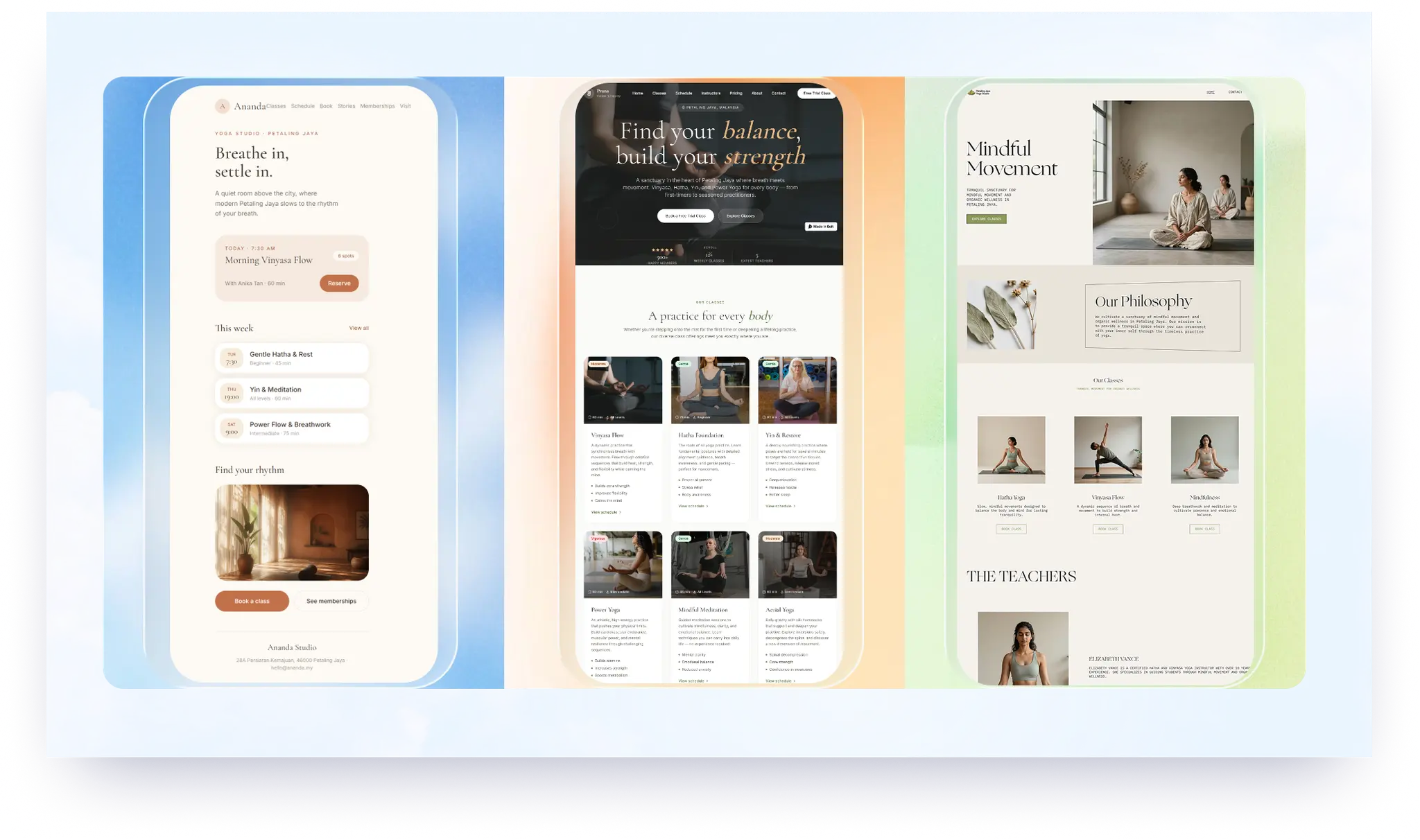
If your site has four or more of these, visitors will clock it as templated in seconds:
- Inter, Poppins or Roboto as the only font
- A purple, indigo or blue gradient somewhere in the hero
- Three feature cards in a row with an icon, a bold title and two lines of text
- Headline copy that says "Elevate", "Transform", "Unlock" or "Seamless"
- Stock photos of people laughing at laptops, or no photos at all (just icons)
- Rounded cards with soft drop shadows on a white or near-white background
- A "Trusted by" logo strip with no real logos
- Emoji used as icons
- Every page laid out as: hero, cards, testimonial, CTA
Does it actually matter for a small business?
Yes, and more than it matters for a startup. A software company can get away with a generic site because people are evaluating the product. A studio, clinic, café or consultant is the brand: people are deciding whether they trust you personally.
Three reasons it costs you:
- Trust. Stanford's Web Credibility Research (2,684 participants, 100 websites) found that 46.1% of people judged a site's credibility partly on its overall visual design: layout, typography and colour. Not the content. The look.
- Memory. If your site looks like the last five sites a visitor opened, nothing about it sticks. They won't remember your name when they're ready to book.
- Conversion. In our own audit data across 59 Southeast Asian small business websites, sites with the weakest Objection Handling (pricing, FAQs, guarantees) scored a full 36 points lower on that dimension than top-performing sites — the single biggest gap of any dimension measured.
Source link: The State of Small Business Websites in Southeast Asia 2026
How do you make an AI website look like your brand?
Five steps, in order. The order matters: most people start at step 5 and wonder why it doesn't work.
1. Decide your brand tokens before you prompt anything
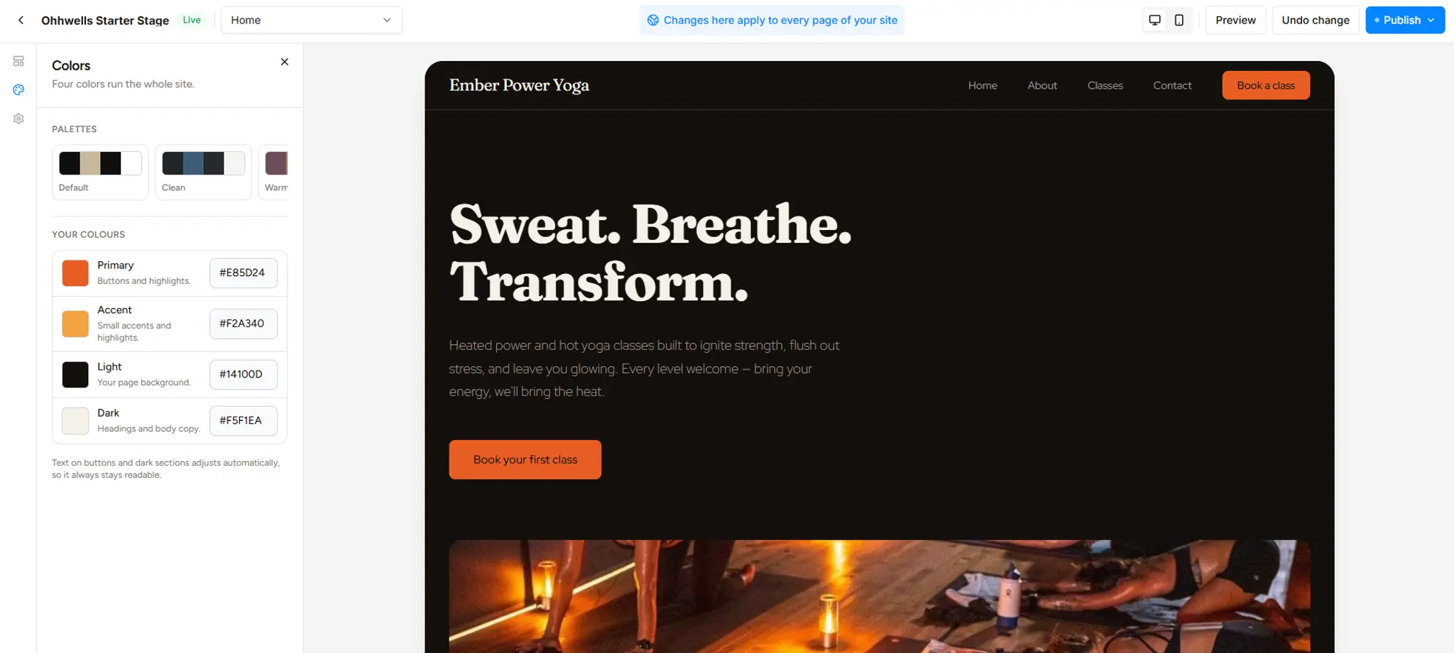
A "token" is just a fixed design decision: your exact colours, your fonts, your button shape. Write down:
- Four colours, with hex codes: a primary (dominant), an accent (secondary highlights), a light (background), and a dark (headings and body copy). Pick them from your logo, your studio walls or your packaging, not from a palette generator.
- Two fonts, one for headings and one for body. Anything except Inter, Poppins or Roboto. Google Fonts is free; a serif heading alone will separate you from 90% of AI sites.
- One button style. Square, pill, or slightly rounded. Pick one and never change it.
If you skip this, every fix below will get undone the next time you regenerate a page.
2. Give the AI design direction, not a description
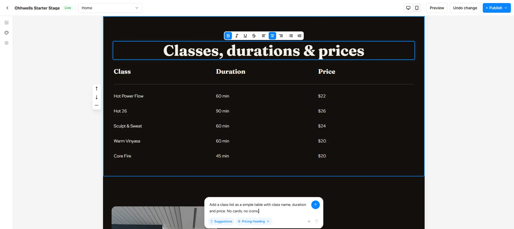
Describing your business tells the AI what you do. Direction tells it how it should look. Compare:
The rule: if your prompt could apply to any business, the output will look like every business.
3. Use your own photos, even if they're not perfect
A slightly imperfect photo of your actual space beats a flawless stock image every time, because it's the one thing no other site can have. Take 10 to 15 photos on your phone in daylight: the space, your hands at work, your product, the door. Upload them before you generate pages so the AI builds around them instead of around icons.
4. Rewrite the headline copy in your own words
AI copy defaults to "Elevate your wellness journey." Nobody talks like that, including you. Replace every headline with something you'd actually say to a customer at the door: "Small classes. Real attention. Come as you are." Short, specific, yours.
Quick test: read each headline out loud. If you'd be embarrassed to say it to a friend, cut it.
5. Break one convention on purpose
Once the basics are locked, pick one deliberate oddity: a hand-drawn underline, an asymmetric layout, a huge single word as the hero, a photo that bleeds off the edge. One is enough. It's the detail people remember, and it's the thing AI defaults will never produce on their own.
Which tools help, and which make it worse?
No vibe coding tool is bad at design; they're built for different jobs. Lovable, Bolt and v0 are best when you're prototyping a product or app. Framer, Webflow and OhhWells are built for marketing websites, where looking like your brand across every page matters more than shipping a working app. Pick by the job, not the hype.
Last checked: 28 September 2026
If you've already built on Lovable or Bolt and like the result, keep it and apply the five steps above. If you're starting from scratch and the goal is a website rather than an app, start with a builder that stores your brand rules, so you set them once instead of every time.
Start with the three decisions
If you take one thing from this: write down your four colours, two fonts and button style before you open any AI tool. Everything else follows.
Want to see how your current site scores on brand consistency, mobile layout and lead capture? Run the free Conversion Score audit → It checks 32 things in about a minute and tells you what to fix first.
Build a site that holds your brand from the first page
Sign up for OhhWells and get 30 free AI credits at onboarding, then 5 a day.
Start free on OhhWells →Frequently asked questions

Keep reading
Does Your Website Look AI-Generated? A 4-Point Check
Run four quick checks on your homepage to see if it looks AI-generated, from copy to photos, plus a simple fix for each one so it looks like your business.
Leaving Squarespace? How to Move Your Website Without Losing Your Google Ranking (2026)
Squarespace only exports part of your site. Here's what you can take with you and how to move step by step without losing your Google ranking.
Leaving Wix? How to Move Your Website Without Losing Your Google Ranking (2026)
Wix doesn't let you export your whole site. Here's what you can take with you and how to move off Wix step by step without losing your Google ranking.
Leaving WordPress? How to Move Your Website Without Losing Your Google Ranking (2026)
Thinking of leaving WordPress? Here's how to move your website step by step without losing your Google ranking, your domain or your email.
How to Use AI to Design Website Sections (Step-by-Step, With Prompts That Work)
A step-by-step guide to designing website sections with AI — set your brand first, then prompt one section at a time. Includes copy-paste prompts.
OhhWells Can Now Build Sections From a Sentence, a Screenshot, or a Link
OhhWells now builds website sections from a sentence, a screenshot, or a link — styled in your site's own brand, live in the Canvas editor.